Find all the information about Vital‘s visual identity in the graphic charter to download in PDF below.
This graphic charter is a reference document that contains all the standard requirements for the use of the distinctive elements of Vital‘s visual identity. These guidelines provide a quality control system and are particularly intended to be communicated to service providers such as graphic designers, web designers, printers, web designers, agencies, etc.
The guidelines included in this charter are based on the fundamentals of the company’s graphic universe and are applicable without exception to all media conveying the Vital brand.
They must imperatively be respected in order to ensure a homogeneous, harmonious and uniform visual identity.
These guidelines make it possible to verify that each graphic element (logotype, font style, colors, etc.) is used appropriately.
Vital‘s logo is composed of a pictogram representing a sphere surrounded by a rainbow, the company’s name and its signature.
The area around the logotype must be minimalistic and entirely free of any text or graphic elements, in order to guarantee its good legibility.
Naturally this exclusion zone must be adjusted proportionally according to the size of the medium where the logo is located. Nevertheless, it cannot be less than 5 mm.
03 Variations
In all cases, the logo must clearly stand out from the background and not present any risk of poor visibility or legibility.
Depending on the context, the logo can be used in one of the following variants:
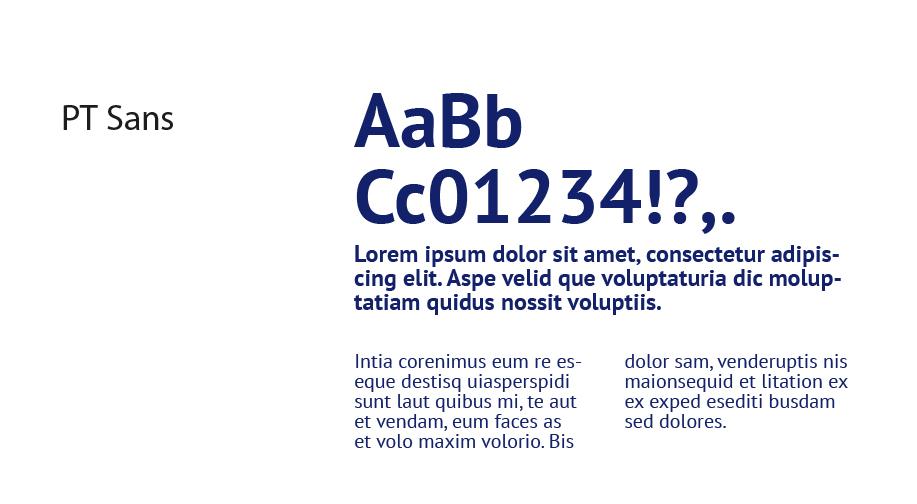
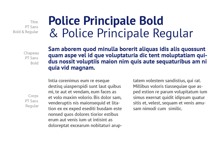
It ensures the coherence of the brand identity and has a strong visual impact thanks to its great legibility.
This typography should be used for all internal and external communications.
It is a fundamental component of the brand and should never be substituted for other typefaces.
PT Sans is freely available on Google Fonts and as such is compatible with all browsers.
Nevertheless, it is possible to use the font Arial or Roboto in substitution when PT Sans is not available for an online communication, and only in this case.
All texts must be written in lower case, never in capital letters, with the exception of certain titles or initials (e.g. SNCF, EDF, etc.).
Ce site Web utilise des cookies pour améliorer votre expérience pendant que vous naviguez sur le site Web. Parmi ceux-ci, les cookies classés comme nécessaires sont stockés sur votre navigateur car ils sont essentiels au fonctionnement des fonctionnalités de base du site Web. Nous utilisons également des cookies tiers qui nous aident à analyser et à comprendre comment vous utilisez ce site Web. Ces cookies ne seront stockés dans votre navigateur qu'avec votre consentement. Vous avez également la possibilité de désactiver ces cookies. Mais la désactivation de certains de ces cookies peut affecter votre expérience de navigation.